

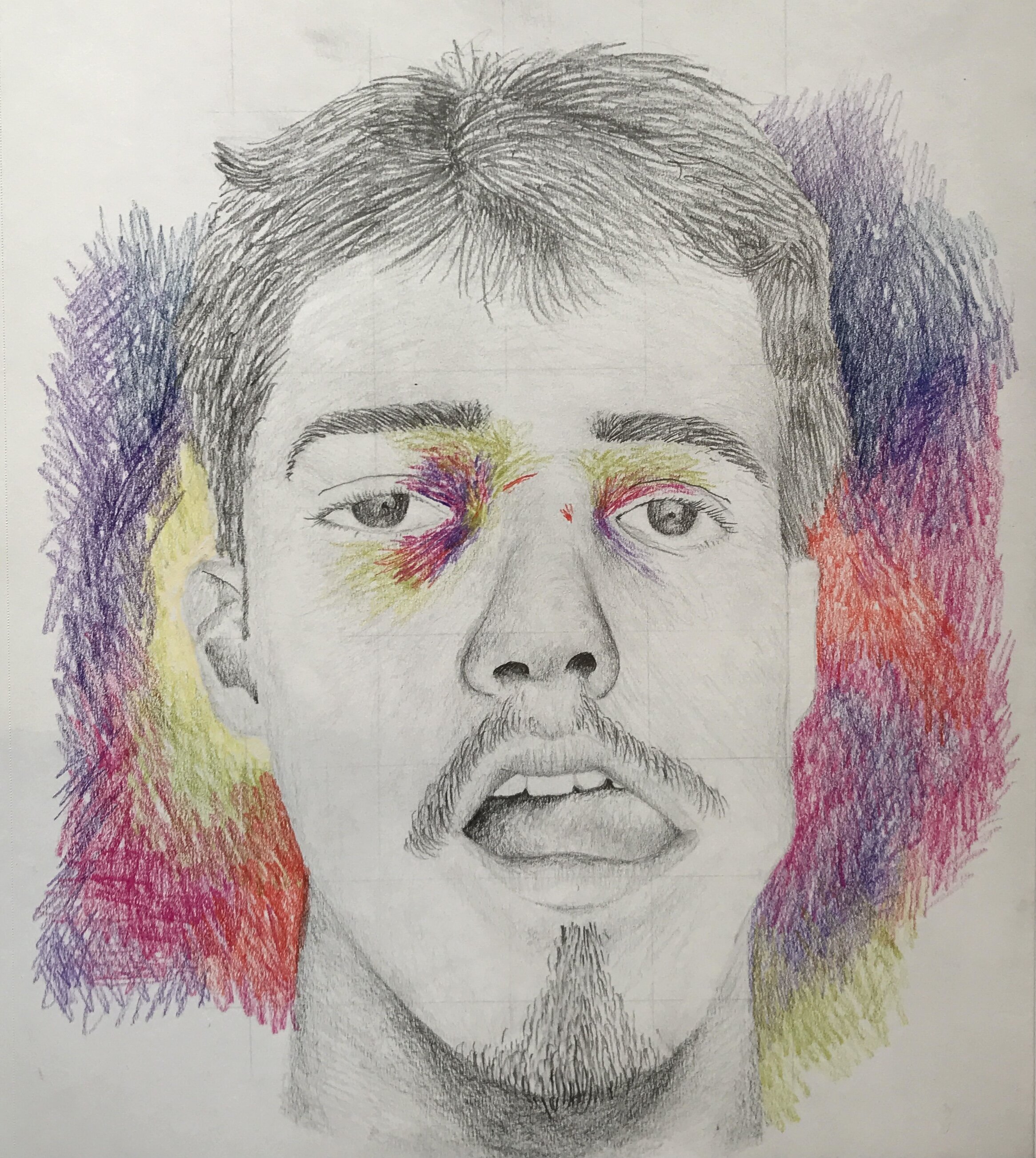
In this piece, I wanted to demonstrate my childlike curiosity underwater. I was snorkeling in Hawaii over the summer and was fascinated at the sun shining through the top of the water. I demonstrate this with the different layers of both my reflection and the water's surface. My face is blue with some orange to represent the water coming through shining on my face, and the smirk on my face is what I would wear as a child, and highlights the curiosity I feel. The whole piece took me about 3 days.

In the second part of my self-portrait series, I show my curiosity in the natural world through the use of collaging layers onto the paper and the collage of the forest itself. The deer placed throughout help demonstrate the depth. The birds are partly a demonstration of my freedom I feel in the outdoors but also a demonstration of the natural world itself. My features are slightly distorted in this because I’m a fairly lanky guy and want to highlight this. It took me about two hours to make both the collage and the graphite depiction of myself.
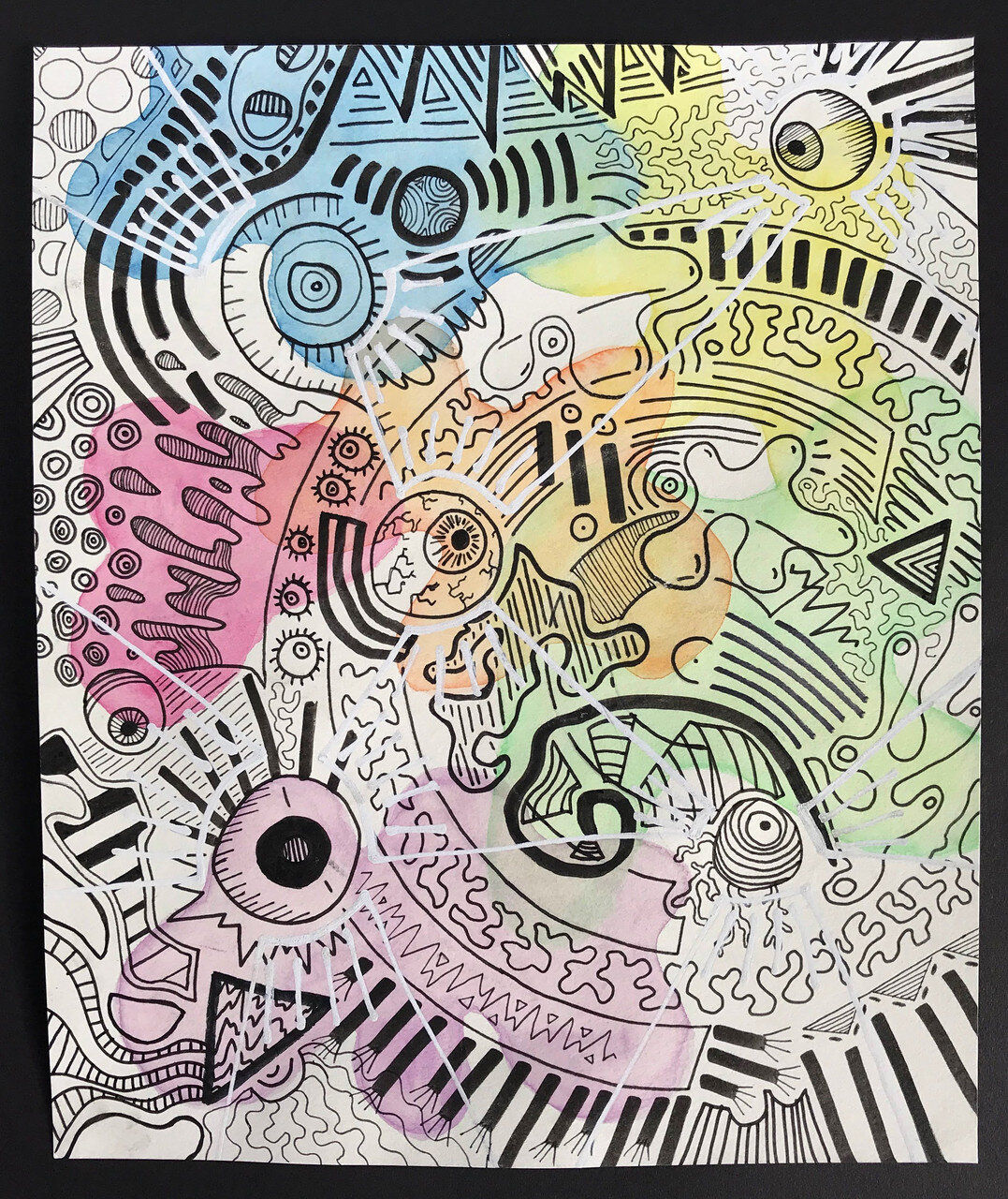
The way we see the world has always been interesting to me. Unless we see it, we have a hard time believing something. Our eyes are our filter between the universe in actuality and how we understand the universe, which is what this piece is about. I used three materials for this, a watercolor first layer, a more detailed second layer of ink, and the third layer of whiteout pen. I used layers to try to demonstrate the filter. If two layers were removed, the piece would be much less interesting or appealing. We have to see everything to understand the whole picture, just like with the universe. The white lines on top connect the different eyeballs in the piece. Everyone has a different view of the universe, and the white lines demonstrate that and how we are all similar but understand things very differently.

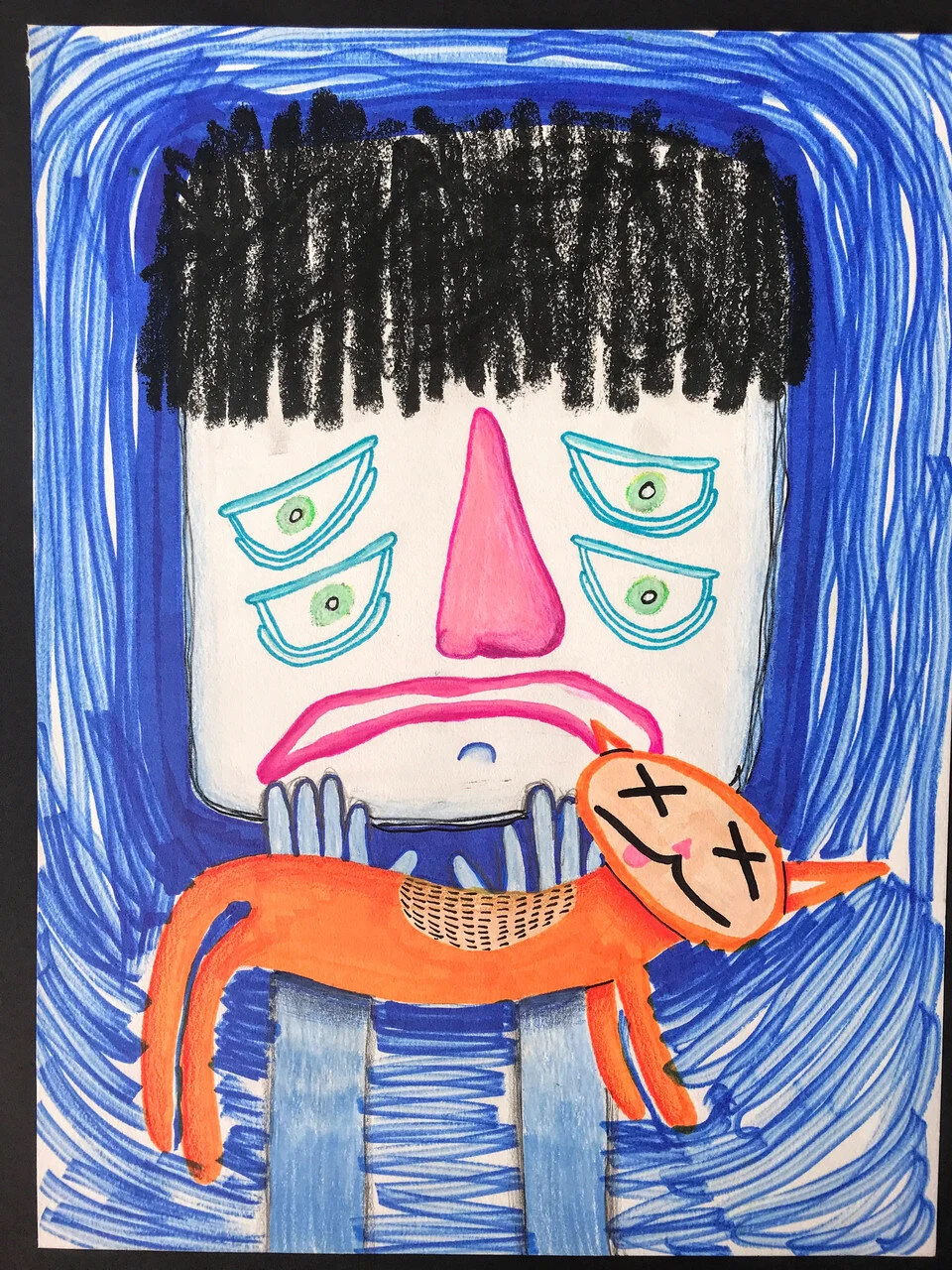
This is a companion piece to The Eyes Part 1, in which I focus more on the audience’s interaction and view of the piece. This is also made with three layers. The first is a cardstock layer with marker drawings of all the eyes. The second layer is a piece of tracing paper, in which I went over the marker drawings with the same pen but also with colored pencils to fill in the pupils. Then, for the third layer, I added a piece of transparent plastic with tears coming out of all the eyes. Again, by removing one layer you lose an important part of the piece, which is also true with our lives. There’s so much we don’t know, but we accept everything we see and believe it to be true and that that is all the truth of the universe.

To complete my eye series, I looked more at how we see the universe and what more might be out there. In my physics class, we learned about light wavelengths we can’t see. The rainbow traveling into the eye are the colors it can see and understand. There are so many more wavelengths of light out there, however, we just can’t see them and thus miss out on a part of our universe. The white balls coming out of the rainbow are these light wavelengths. The piece focuses on finding other ways to understand the universe, such as feeling it or exploring it. The planets hanging from the eye are like a mobile or a puppet, showing how our eyes control the universe we understand. The net in the top right is catching and filtering the rest of the universe, stopping us from seeing things and restricting our understanding of everything.
One morning, on my brother’s bike ride to school, he found our neighbor’s cat dead outside their house. He had to go and knock on our neighbor’s door and deliver the horrible news. I made this piece about that, and the emotions around it. Death has always been a weird subject for me. No one close to me has ever passed away, and thus I don’t really understand the loss that comes from it. Hearing my brother tell the story is one of my few interactions with that feeling, and I wanted to depict it here. I used a variety of materials in the piece in ways that draw the focus towards the pained expression on the person’s face. This piece was much less a focus on technique and application than on emotion and concept. It took me about an hour to complete the whole thing.

The assignment for this piece was to draw 25 things. They had to be related in some way, but there were no restrictions on what we had to draw. I was initially going to draw 25 monsters but during the sketching process, I realized I was having much more fun drawing the monsters’ faces and emotions than the rest of the body. Because of this, I decided to draw 25 monster faces expressing an emotion that began with each letter of the alphabet (anger, boredom, confusion, etc.). My goal was to show as much emotion as possible in each face while maintaining variety between the monsters’ features. The hardest part was making sure I didn’t put too much of the same color in one area of the piece and keeping the colors balanced, but I also think that the color is one of the best parts of it. This was my first piece for the MICA pre-college illustration course, and it took me about 3 days.
The second assignment for the MICA illustration course was an editorial piece for an article title of our choice. I chose ‘When Mothers Bully Back’, an article about mothers who fight against their child’s bully. I wanted the most prominent part of my piece to be the emotion, the fear the bully feels, the anger of the mom, and the pain of the child who got bullied. I did so not only through the looming danger of the mom towering over the bully, but also the way everyone in the background is staring at them. I drew the characters, flowers, grass, and the sidewalk they are standing on on separate pieces of paper to show depth but also so I would have more control over the characters’ positioning in the piece. I used colored pencils and ink for this piece, and it took me about 4 days to complete.
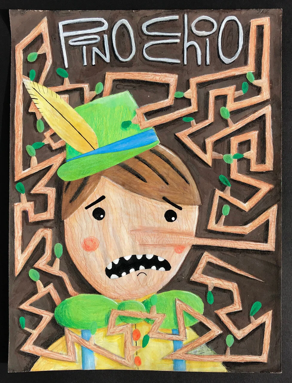
This piece was a response to the third assignment given at the MICA precollege illustration course, in which we were supposed to draw a cover for a storybook of our choice. I started by sketching possible covers for a variety of books but decided that the emotion and humor in my Pinocchio cover were my favorite. I wanted Pinocchio’s nose to completely fill the page and surround Pinocchio, showing how out of hand his lying gets. He looks evidently distraught, which contributes to this chaos. I used colored pencils for the face and nose but painted the brown background on with gouache to give it a different texture. The hardest part of this piece was drawing a semi-realistic wood texture on Pinocchio’s face and nose, but I think it made the piece a bit more believable. Overall the piece took me about 3 days.

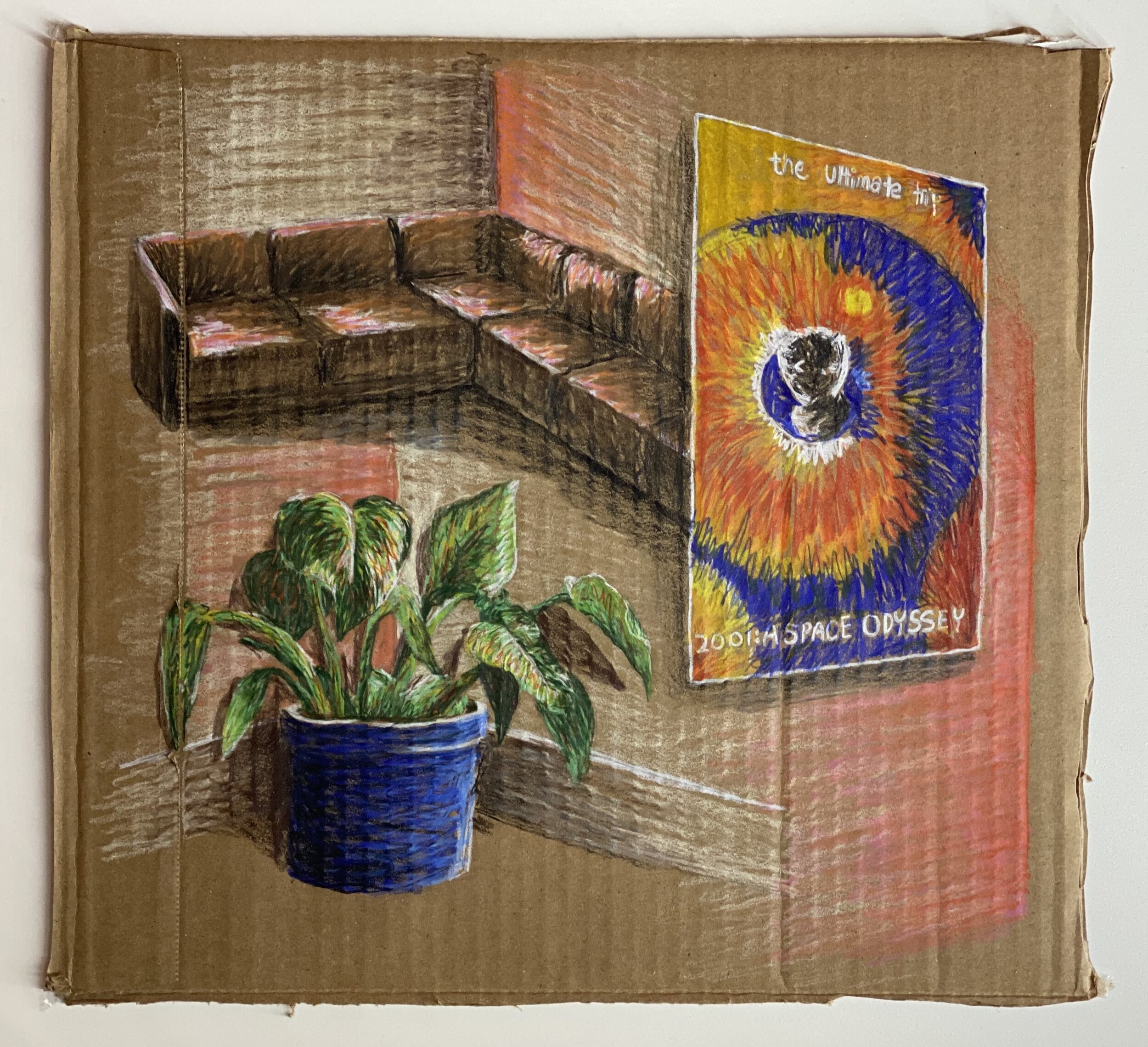
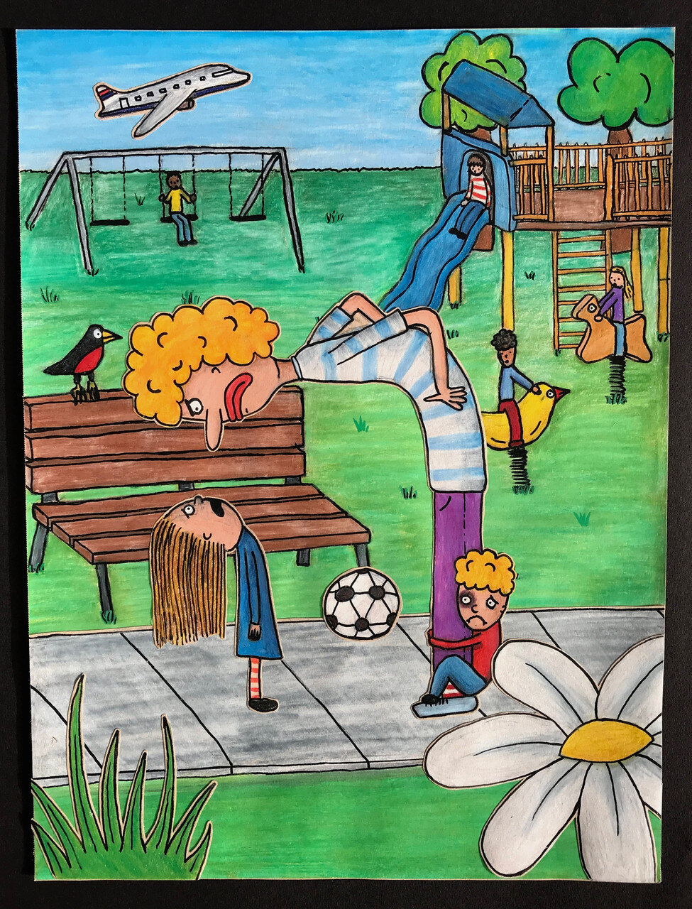
For my final piece at MICA’s pre-college illustration course, the assignment was to make any zine of our own design and concept I had a few ideas I thought I would try, but I wasn’t super passionate about any of them. I had an idea that someone should make a zine of a variety of different bathrooms but was worried that I didn’t have enough technical skill to achieve that. No one seemed as interested in the idea as I was, so I decided to tackle it myself. I obviously wanted humor to be a central aspect, so I incorporated a variety of funny bathroom scenes. I wanted the bathrooms to be from the same perspective and style, but to have a different story behind each room, so they are all decorated differently. I used a tinfoil collage element as maybe a mirror, window frame, shower head, or something else in every room to make the piece more visually interesting.

Humor has always been a central part of my life. I decided to let my humor and creativity flow with this piece, starting with no real plan. At first, I had a cat wearing a suit. I was about to draw paws but had so much fun drawing the cat head that I replaced the paws with two more heads poking out of the sleeves. I thought of the quote after drawing the ‘hands’ on and thought it was hilarious, so I included it. The whole piece took me roughly an hour and was made with colored pencil and ink for the outlines.

Looking to make a companion to my piece “Cat hands”, I wanted to see what I could do with dogs as my subject. The cat in “Cat Hands” is sad because it’s missing out on his favorite drink. The dog is much more balanced, sacrificing not being able to sit down to annoy people on the bus. The dog is standing not just because it makes drawing both heads easier, but because he physically can’t sit. Instead, he stands and terrifies a woman with his second head. The woman’s face is blue to show how surprised and afraid the head makes her. The composition is oriented so that the two bottom faces are the most prominent while leaving room for the speech bubble in the corner. Again, I wanted humor to be a central element in this piece, so I started by sketching the dog with a head on his butt and played with different scenarios from there. I wanted the text to be pretty similar, maintaining the same humor and sadness from the original piece.

This is a personal reflection on global warming and how it affects people. The person in the middle is not supposed to be anyone person, but rather represents a lot of different things. The way I drew the water around the cut-out person is to show motion as if the person is swimming upstream. I think everyone can relate to that at times, feeling like they are working hard but not going anywhere. I also think that’s true for a lot of environmental issues. There are groups who do really great work to overcome climate change, but they don’t make enough change to fix anything. By putting a flower on the person’s head, I want the viewer to relate the person to the natural world. No matter how hard it swims, the current and hands, representative of people who make the problem worse, pull Mother Earth into the despair of the cityscape below. The piece only took me about 1.5 hours, but the concept was something I thought about for a few days prior.

This was a collage piece inspired by a magazine page of a man in a red jacket on a glacier. I took this page and cut out the water, replacing it with something more abstract and unknown. The sun is setting, making way for what I believe to be the most ominous and unknown thing, outer space. The purpose of this piece is to show how alone and stranded you can feel. As the sun sets on the man alone on the glacier, he begins to see how alone he is, and how little he knows about where he is. The hardest part about this piece was making the abstract water fit right in with where the glacier ends. Overall, it took me about 2 hours of trial and error until I ended up with a piece I was happy with.
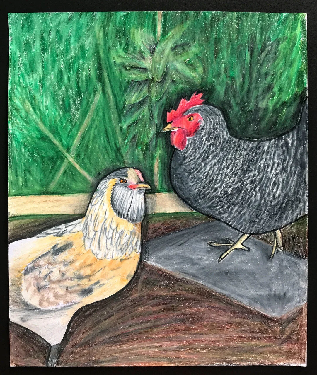
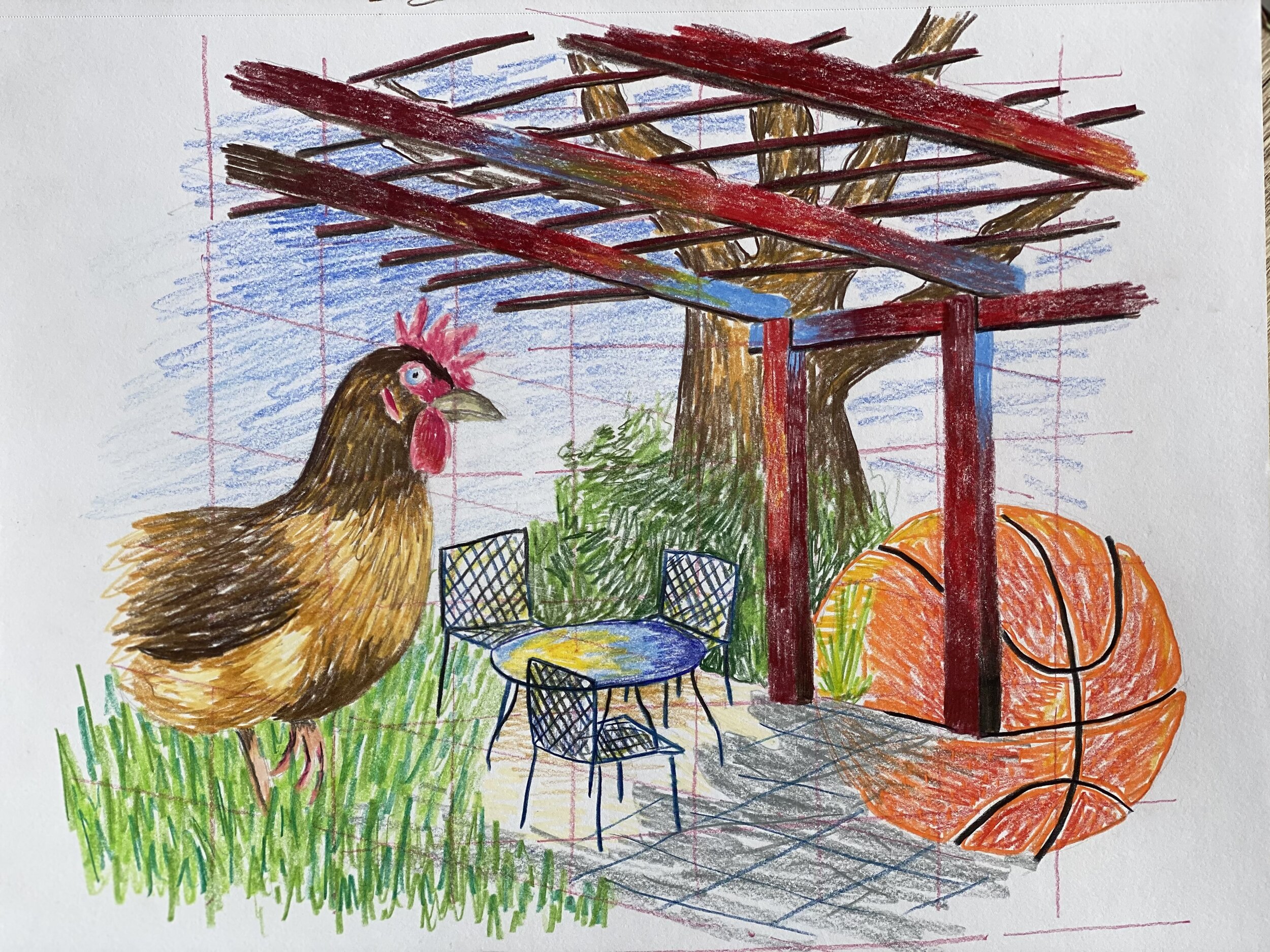
My dad and brother are allergic to animals with fur. Because of this, we were never allowed to get a dog or cat. Instead, we have four chickens. We call them ‘the girls’, and I always think of them as a judgemental group of ladies. So, when I decided to draw two of them, I wanted this emotion to be apparent. I did so by pulling focus into their eyes and the skeptical look they have donned. I spent about an hour and a half on this colored pencil piece. I chose to use colored pencils because I’m most practiced in this material. It’s a good way to be precise while allowing me to explore color. I like the way that the chickens turned out, but I’m not as big of a fan of the background.

This is a personal piece I made as part of a series where I explore various religious gatherings and interpret what the speakers have to say and how the audience is reacting. It took me three days. The Metaphysical Church of Enlightenment preaches that we shouldn’t just think outside the box, but instead realize that society has created the box. To truly live, we have to ignore the box. The house was obviously built by a person, which symbolizes the ‘box’. I wanted the main focus of the piece to be the light bursting through the house, which symbolizes the character trying to break out and see what’s outside. I chose to use oil pastel to draw the right hand and box because I’m much more precise with this medium than paints. The left hand, however, is collaged on, interacting with the piece as if the character realizes that he is confined yet again, this time by the 2D constraints of the painting. The natural elements crawling up his leg represent myself and how I too am confined.

The second piece to my religion exploration series focused on Glide Memorial Church and specifically Cecil Williams, the pastor. On the day of the service I attended, it was Cecil’s birthday. I wanted to highlight the freedom and hope that Cecil has brought to so many lives through a variety of colors and mediums. I wanted to put the most detail into Cecil, so I decided to use graphite to sketch him with pigeons flying out from underneath. Pigeons are usually seen as disgusting and dirty, but Cecil allows even them to be free. The congregation is a collage of various people I found in old magazines, with no two people looking the same, to show the quality that Glide pushes. Finally, I wanted the stained glass windows to be colorful but not to overpower the rest of the piece, so I made it very simple. However, I still think that Cecil is not the most powerful portion of the piece which is disappointing. Overall, the piece took me two days of conceptualization and creation.


