
Running in the Rain
Running in the Rain
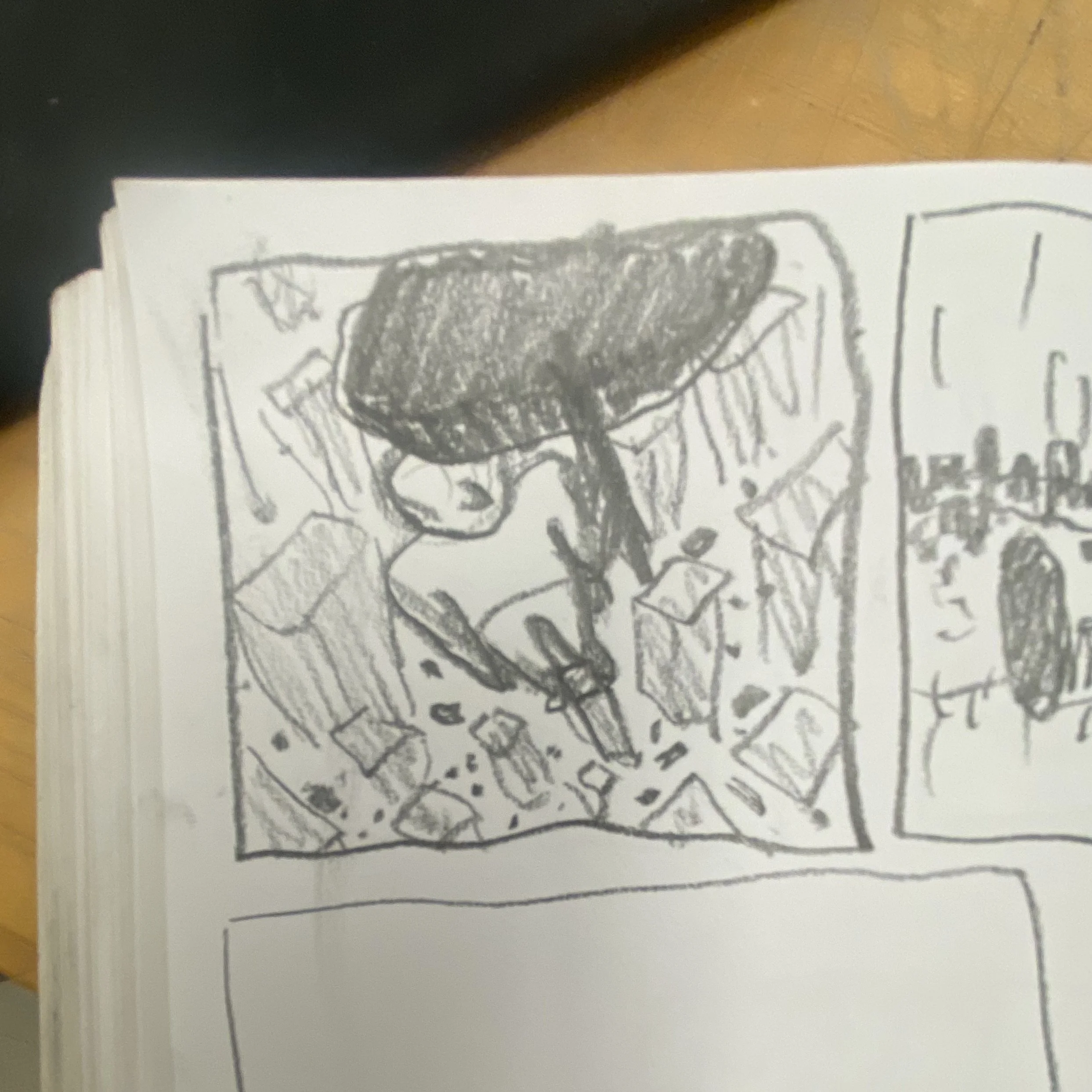
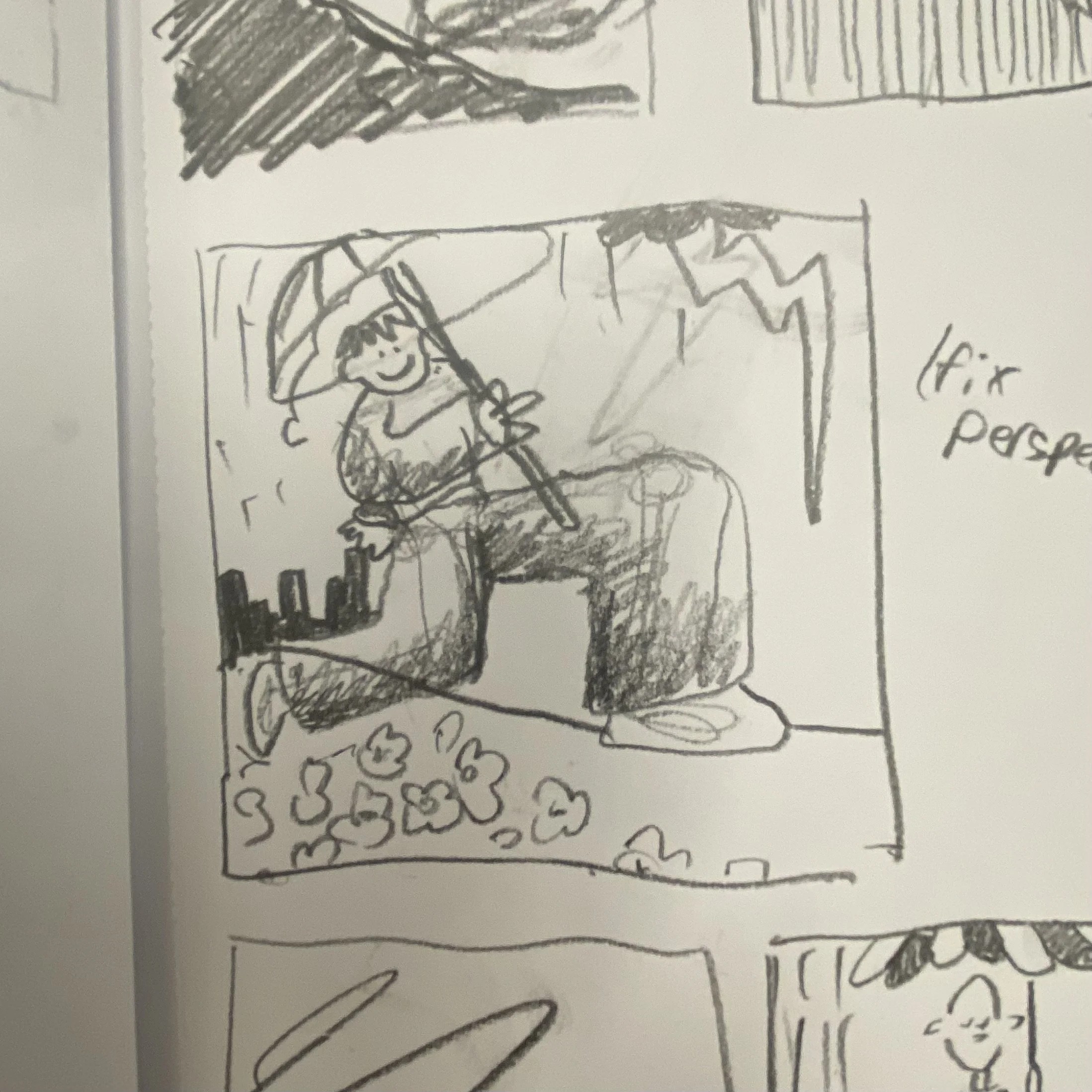
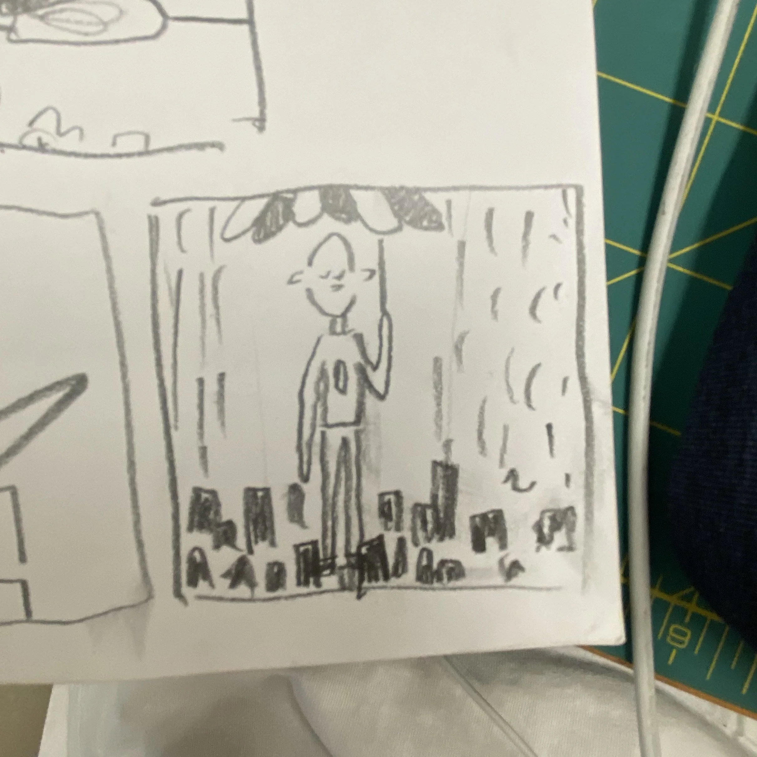
Running in the Rain Initial sketches
Throughout my illustration career, I’ve been developing a style that balances clarity, aesthetics, and effortlessness. I’ve always been drawn to illustrations that feel approachable — not because they’re simple, but because the use of line, color, and composition is all intentional. Rather than labor over unnecessary detail, I want my illustrations to convey my thoughts cleanly and concisely.
This series reflects that search. Each illustration is a response to a poem, with the style of each piece building on the last. With every iteration I refined what worked and shed what didn’t, moving closer to a visual language that delivers the emotion and detail I want while still feeling accessible and direct.
Red Eye
The first piece in this series, Red Eye, is very close to my traditional illustration style. I tried to focus more on color/shading on this piece, emphasizing the glow of the computer screen in a dark room.
Missing Out
For the second piece, I wanted to push myself away from the outlines I usually stick to. Although I enjoy the detail I can add to a piece with outlines, I think it adds a structure I don’t necessarily need. In this piece, I wanted to challenge myself to get my vision across without them. I also wanted to try a ‘flatter’, cell-like shading style.
Market Day
I really liked the shading style and lack of outlines in ‘Missing Out’, but I felt I lost a lot of the texture that I enjoyed in ‘Red Eye’. For my third piece of the series, I wanted to experiment with new brushes and textures. The goal of the new brushes was to add texture, depth, and shading in a way that felt natural and ‘painter’-ly.
Monument
‘Market Day’ felt very successful to me - the color, texture, and style all aligned with my goals and got my vision across. However, it strayed away from the ‘approachable’ nature I aim for in my pieces. The hand-drawn nature of the texture was visually appealling, but took far longer than I had hoped. The goal of ‘Monument’ was to push forward with a lot of what was successful in ‘Market Day’, but with a new, less time-consuming method of texturing.
Drawing Process
Running in the Rain
Finally, I landed on a style that hits the perfect balance of texture, detail, and refinement, while still hitting that sweet spot of ‘accessible’. Although I liked the lack of outlines in ‘Missing Out’, ‘Market Day’, and ‘Monument’, I felt a lost a bit of the detail I was able to provide in ‘Red Eye’. This led me to a style that retains some line work in the details, but doesn’t outline every element on the page.
I kept the texturing style that I used in ‘Monument’ - rather than painting each shadow onto my objects, I went over my shapes with an eraser that added a crayon-like feeling. This provided the texture I was looking for in a way that matched my typical child-like imagery and ease of drawing.
Overall, I’m really proud of this piece. Outside of the style, my use of color and composition achieves the level of play and motion I was aiming for. Although it’s subtle, the dark building in the back juxtaposed with the emerging sun gives a feeling of hope, and way I drew the clouds, rain, and puddles really provides a sense of Spring - you can tell the rain is just passing, and sunlight is beginning to shine.